Background
As part of 60 hours of coursework in UI/UX design, I created a number of different case studies to hone my design skills. From creating a color system, to wireframing, developing a user persona through UX research, all the way to designing a landing page—I greatly expanded my UX skills and upped my design game.
Create a Color System
Scenario: You are a UI designer for a digital work management tool. Your team is reimagining the brand image, aiming to create a fresher look that sets the tool apart from competitors.
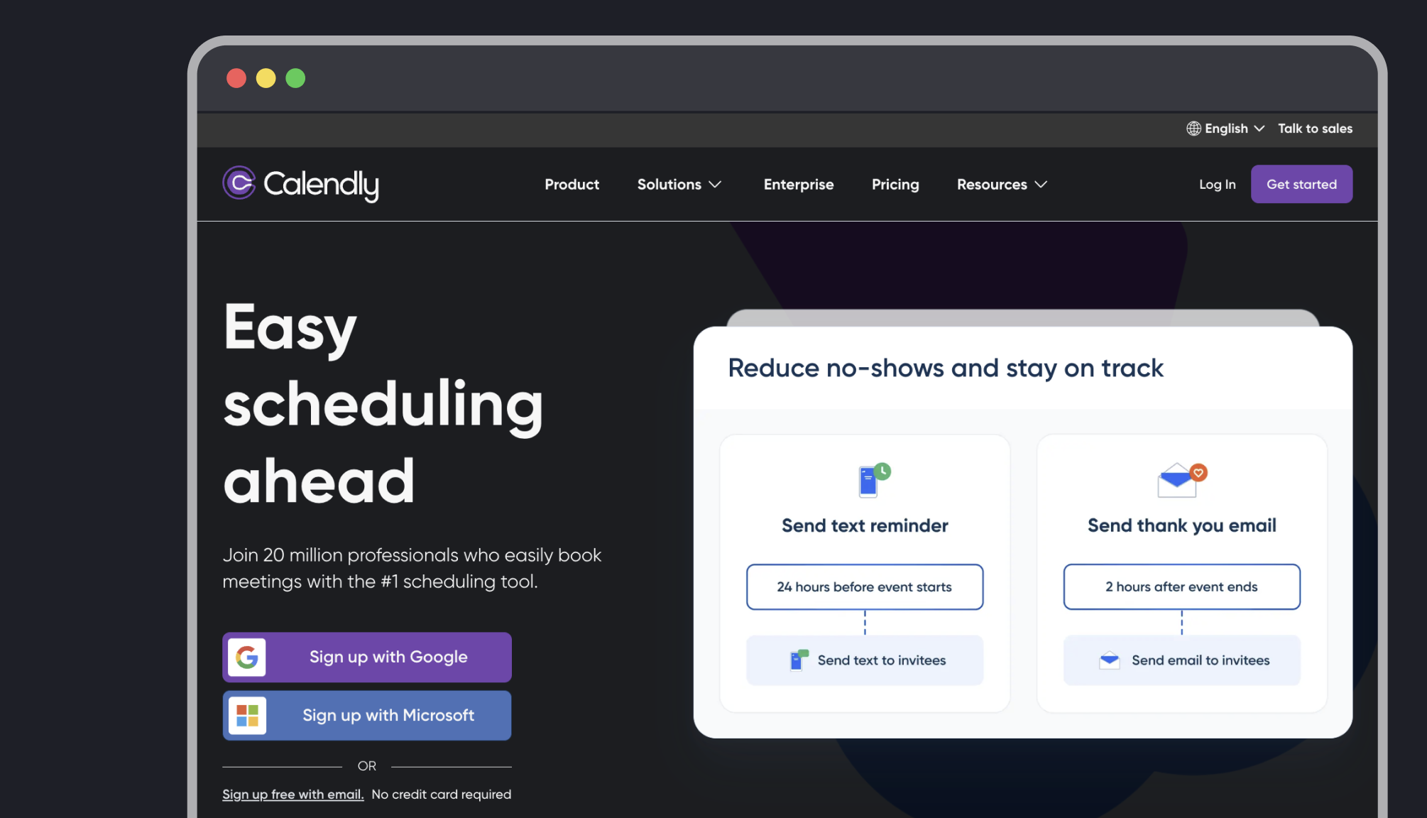
Concept: Calendly is a popular SaaS platform for work schedule management. I noticed that they don’t have a dark mode and even found requests from users asking them to add the feature. Here I’ve laid out what a dark mode for them might look like, taking into consideration best practices for design and accessibility.
View case study: Calendly Dark Mode
UX Research and User Persona
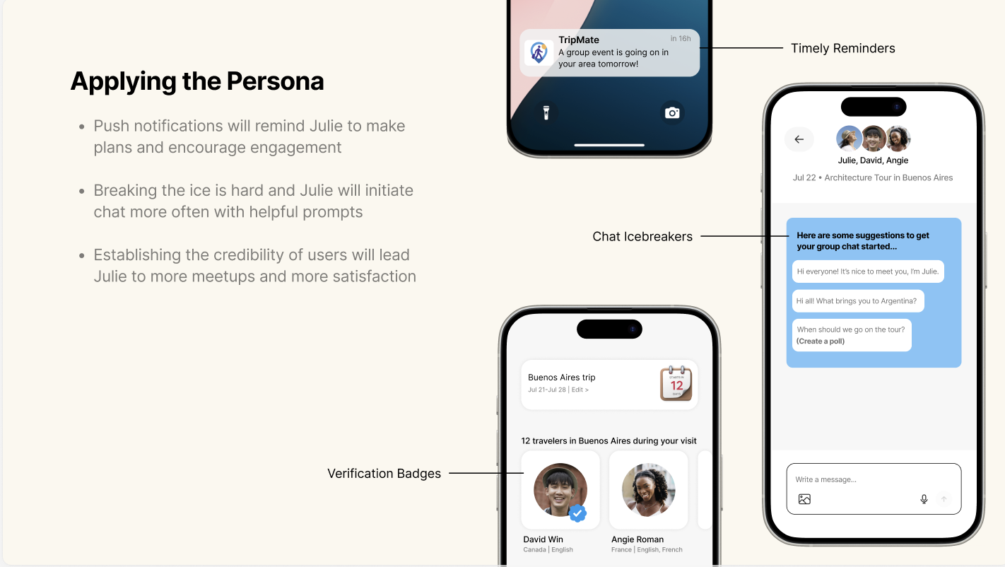
Scenario: You are a UX designer for a social media platform. A few months post-launch, you’ve noticed a decline in user engagement. To address this, you plan to conduct user research to understand their needs and pain points better.
Concept: The TripMate social media application let’s you create an itinerary for your trip and meet up with other travelers visiting the same sights. By developing a research survey, we will gain a better understanding of our customers and develop a user persona to help us uncover changes we can make to improve user engagement.
View case study: TripMate User Persona
Wireframing
Scenario: You’re a member of the design team at a video streaming service. Your task is to brainstorm ideas and design wireframes that offer a unique approach to service usability, setting it apart from competitors.
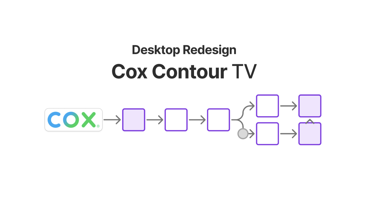
Concept: Cox Communications is the third largest cable television provider in the United States and they provide a video streaming service to their customers. While their application features a respectable design, users accessing the streaming service via the web are treated to a separate, poorly designed interface.
In order to improve the Cox Contour web experience, I elected to research 3 different task flows and then made comparisons with Cox’s native app and HBO Max’s desktop interface. Adapting some features from the Contour App interface provided consistency across the brand interfaces. Then adapting pieces of HBO Max’s interface helped deliver an improved experience for desktop.
View case study: Cox Contour TV Desktop Redesign
High-Impact Landing Page
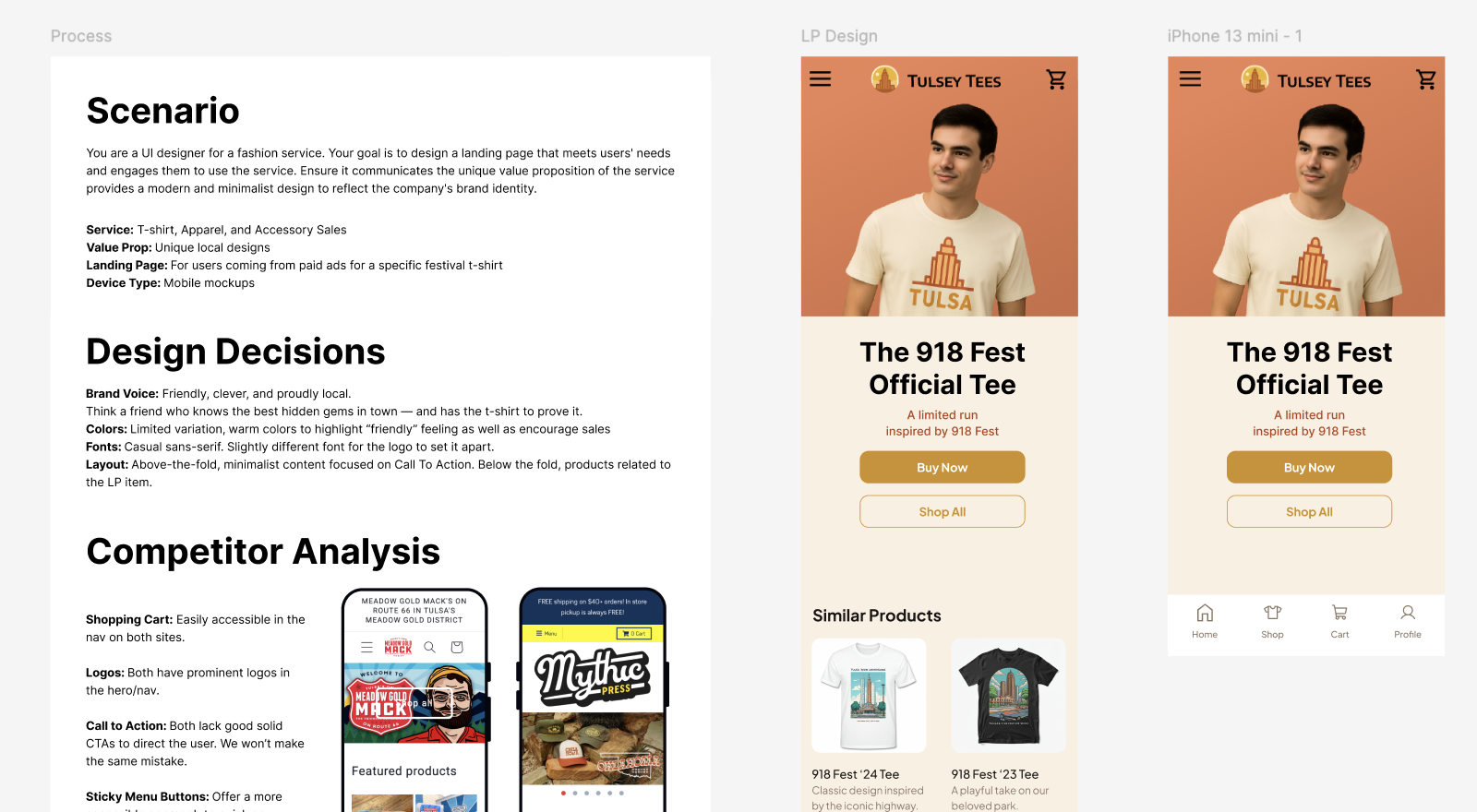
Scenario: You are a UI designer for a fashion service. Your goal is to design a landing page that meets users’ needs and engages them to use the service. Ensure it communicates the unique value proposition of the service provides a modern and minimalist design to reflect the company’s brand identity.
Concept: Tulsey Tees is a design and apparel shop making products that celebrate local events and local businesses in the city of Tulsa. I’ve planned a Landing Page to handle traffic coming in from paid ads for the official t-shirt for the city’s popular 918 Fest. Each detail of the design is intentional, from the warm color scheme to the direct tone of the CTA copy. The LP makes it easy for visitors to find what they want and make a purchase.
View case study: Tulsey Tees LP